
Print-Ready Files: The Essential List
Final art (FA), print-ready files, high-resolution art...
These are just a few of the terms that sometimes cause designers, desktop publishers, and account managers to get into cold sweats. But are these the “boogeymen” that everyone must flee from? I honestly don't believe that's the case. Of course, there are some cases that are more complex than others, such as packaging files, but let's leave those for another time... Without complicating, basically, a ready-to-print file is a file with all the technical characteristics necessary for quality reproduction. In simple terms, it's a digital file prepared for the physical world. At Finepaper, we produce dozens of products a day and verify all the digital files that lead to those products. We help avoid many problems, but every day, we also learn about new situations and possible solutions. In fact, the only rule that always works is to never stop believing that you can find more problematic situations where you least expect it.
“... to produce a printed product, there are physical, chemical, and mechanical processes that are much more complex than projecting an image onto a screen.”
Why is it necessary to prepare a file if it looks great on the screen? This is where we come across the true essence of a print-ready file. And the answer is simple... to produce a printed product, there are physical, chemical, and mechanical processes that are much more complex than simply projecting an image onto a screen. Printing plates, inks, printers, and finishes are all involved.
You've heard of sangria, CMYKs, crop marks, low-resolution images, and direct colors, right? Most of the art that is sent for print does not come with these specifications or have additional elements. There are no mandatory specifications to create a print-ready file. Talk to us or your print provider, but in the vast majority of cases, there are some specifications that cannot be omitted.
Before starting, it is important to know or confirm the specifications requested by your printer: size of the work, number of colors to be printed (for example, 4/4, which means four colors on the front and four colors on the back), whether the work has folds and other characteristics that may be important, such as the printing process to be used. If you notice that information is missing or you have questions about a specification, it's best to ask before submitting the file. Sending multiple files should always be avoided.

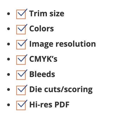
Here's a good checklist we've put together to help us prepare files for printing:
As mentioned before, there are more complex end-art (FA) specifications (trapping, fold compensation, cutting, overprinting, and a few other things), but we consider these to be the basis for any end-art. The first step is to confirm the final size of the work. You should start here, because if it's not the correct size, you'll probably have to adapt the design, which, in the end, may require new customer approval, new content, etc. We suppose you know how to verify this.
“If you notice that information is missing or you have questions about a specification, it's best to ask before submitting the file.”
Next step: check the colors used in your files to ensure you have the necessary specifications for the designated printing process. First of all, with regard to 4/4 colors, this normally refers to four-color printing on both sides of the sheet (or page). It can also mean “process colors” or CMYK (cyan, magenta, yellow, black; just a note: the “K” does not come from “black” but from “color key”, because, for several reasons, this is actually the key color that makes this reproduction process work). With this color model, we basically print “all colors” by mixing these “primary” colors - printing one at a time over the others. Most non-black and white print jobs are printed this way. In some cases, we use direct colors that are created by mixing primary colors outside the printing machine and printing with them later.
Okay, let's go back to the file. In the swatches tab or window (in Adobe ⓒ Illustrator ⓒ or Indesign ⓒ), we can review the colors used in the document. I always update the list first:
- Open the samples window and open the panel menu in the upper right corner.
- Select any unused colors by clicking this command.
- Delete them using the trash can icon.
- Return to the swatch panel menu and select “Add Unnamed Colors”.
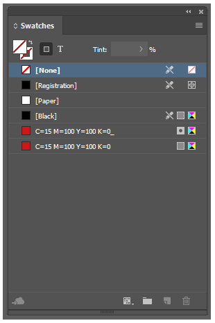
As you can see in the example above, we have two shades of red and, although they look the same, you can distinguish them by the marks to the right of the color name. The last symbol, with colors, indicates the composition of the color, that is, the color space. In this case, it's CMYK in both shades of red. The gray square without the ball indicates that it is a process color and the square with the ball means that it is a direct color. If the work should not contain direct colors, it is necessary to convert them to process colors. Double-click the color and, where it says “color type”, choose “process” from the drop-down menu.
We do this for all identified colors. Another task completed!
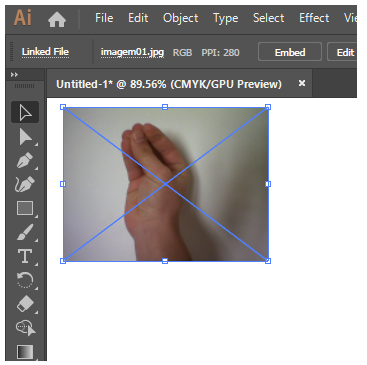
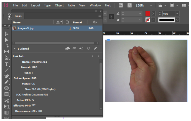
Let's move on to image resolution. As you can see in figure 02 (Ai), when selecting an image, the information will appear in the upper left corner: file name (imagem01.jpg), color space (RGB), and resolution (PPI: 288). In Figure 03 (InDesign), in the “links” tab, we have information about the image (name, location, color space, resolution, etc.). On the resolution side (“current PPI” and “effective PPI”), what matters is the value of “effective PPI”. In this case, it's 277 PPI (pixels per inch), which is equivalent to DPI (dots per inch). Well, to be strict... it's not exactly. But let's put that aside for now. I would really like to finish this post.
How do we know the correct resolution to print? Without wanting to bore you with mathematical formulas, the industry tells us that 300 DPI is a high-resolution image. For offset printing (and I know printers will criticize me), the minimum DPI I accept is 250 DPI. Whenever you need to convert the image to CMYK, edit the photo in Photoshop and convert it to CMYK using the Image/Mode/CMYK commands.
Okay, this file is almost ready! Sangries! If you don't, 99.999% of the time the printer will return your file asking for the missing indents. Well, industrial cutting techniques aren't always extremely accurate. When using guillotines, it is almost certain that the first and last sheets will be slightly different. That's why we extend objects, images, lines, etc., that “touch” the page margin (left, right, top, and bottom). So extend them all by at least 0.125". I mean literally extend, not enlarge or move.
Another important thing to place in the bleeding zone are the fold marks, as they are not placed automatically. These are simply lines that show where your work should be folded. Then, place a dashed line about 0.08" outside the art area and away from the page margin. Ahhh, just one more thing... Crop marks are defined when you save the PDF ready for printing. Do not place them manually. This is just a waste of time and the risk of getting confused is high.
We have the final art finished.
(Woohoo!)
Let's create the print-ready PDF:
- Open the file menu. Click “Save As/Export PDF”.
- Give your file a name and save it. Important note here: Don't save your PDF as an “interactive PDF”. The CTP units on your printers “speak” postscript, FOGRAS, and other strange languages and don't work well with things they don't understand. So send them something they recognize.
- Choose the default PDF/x-1A:2001. This may vary, so it's a good idea to check with your print provider.
- Select the pages you want to save and DO NOT check “Double Pages” (unless your printer specifically asks for this option).
- On the “Marks and Inseids” tab, select “Cut Marks” and “Use Document Bleeding Settings” (if you haven't configured them in the document settings, you can enter them manually here)
Just to emphasize once again, these are the basic steps for creating print-ready files. Of course, there are many other important things, for example, image processing, the right choice of color profiles, etc. I promise to talk about this next time. Ahhhhh... very important: The final art is the last step in the design process (whether for a business card or a billboard) and it's a big responsibility. If you feel uncomfortable with this task, ask for help! Talk to us, a colleague, a boss, or the printers themselves. Everyone wants the job to turn out fabulous.
To conclude, I would like to share two resources, which are not being updated, but are still great sources of information, from preprint to print: Prepressure and Printwiki.
Thank you for your time and we hope we've made the whole process a bit easier to understand. Until the next time.